Building a Comprehensive SEO Monitoring Dashboard in Power BI
May 2024 by Milap Savla
Tools/ Methods Used: Power BI, DAX (Data Analysis Expressions), M Lang (Power Query), API Integration, Google Analytics, Scheduled Data Refresh, Data Modeling and Data Vis.
Abstract
I've worked in the SEO industry for over 6 years, and last year I dedicated time to building a powerful Power BI dashboard to measure the impact of our efforts on clients' SEO goals. This dashboard consolidates data from multiple sources, visualises trends, and analyses performance, enabling data-driven decisions that drive results. The dashboard automatically updates daily.
In this blog, I’ll guide you through how I created this 5-page dashboard, designed to track keyword rankings, brand uplift, competitor performance, campaign traffic, and link coverage—all tailored to assess and enhance PR link-building campaigns.
Recording of Full Dashboard (client logo, company name and URL censored)
Key Features
- Multi-Source Integration: Pulls data from six different sources, including four API endpoints and two data connectors, ensuring comprehensive SEO insights.
- Automated API Calls: Uses Power Query Editor at its full potential to dynamically generate hundreds of API request URLs, enabling seamless retrieval of historical keyword data.
- Flexible Dataset Management: Utilises a well-formatted online Excel sheet as a foundation, allowing for easy adjustments to clients, keywords, and date parameters across datasets.
- Automated Data Refresh: Ensures data is up-to-date with automatic refreshes every 12 hours, providing real-time performance insights.
Technically, a multi-page Power BI workspace is called a 'report,' but I refer to it as a 'dashboard' in this blog since that's what most people recognise it as.
Page by Page Run-Through
Page 1. Keyword Rankings Page
The Keyword Rankings page tracks a client’s Google rankings over time, starting from the onboarding week. It visualises the weekly average Google base rank and highlights specific campaign launches on the graph, providing clear insights into the impact and effectiveness of SEO efforts.
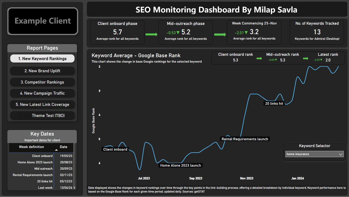
Metrics:
- Average Google Base Rank (weekly average).
- Rank Over Time:
- During client onboarding week, mid-outreach and latest rank.
- Number of Keywords Being Tracked.
- Keyword-Level Breakdown:
- All metrics are available for individual keywords, accessible via the keyword selector.
Data Source:
- Getstat API: Getstat provides keyword ranking data. By using the API, the daily rank data is fetched and aggregated into weekly averages for visual representation in Power BI.
Page 2. Brand Uplift Page
This page measures the impact of PR link-building on a client’s brand visibility. It focuses on branded keywords and shows how impressions and clicks evolve over time. By comparing these metrics week over week, this page helps assess whether link-building campaigns are increasing brand awareness and traffic.
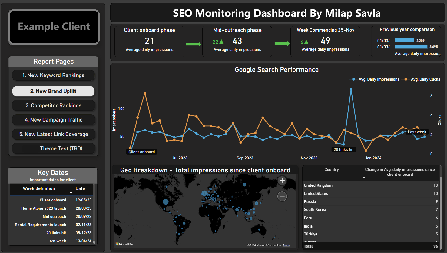
Metric:
- Change in Average Daily Impressions: Tracks year-on-year comparison for branded keywords.
- Change in Average Daily Clicks: Tracks year-on-year comparison for branded keywords.
Data Source:
- Google Search Console (via Windsor.ai): Since Google Search Console does not offer an official API for branded keyword filtering, Windsor.ai acts as a connector to extract this data and make it accessible in Power BI.
Page 3. Competitor Rankings Page
Understanding how a client’s keyword performance compares to their competitors is crucial. The Competitor Rankings page provides insights into the share of voice (SOV) for the client and competitors. It tracks changes over time and highlights the gap between the client and their competitors, helping demonstrate the effectiveness of link-building efforts.
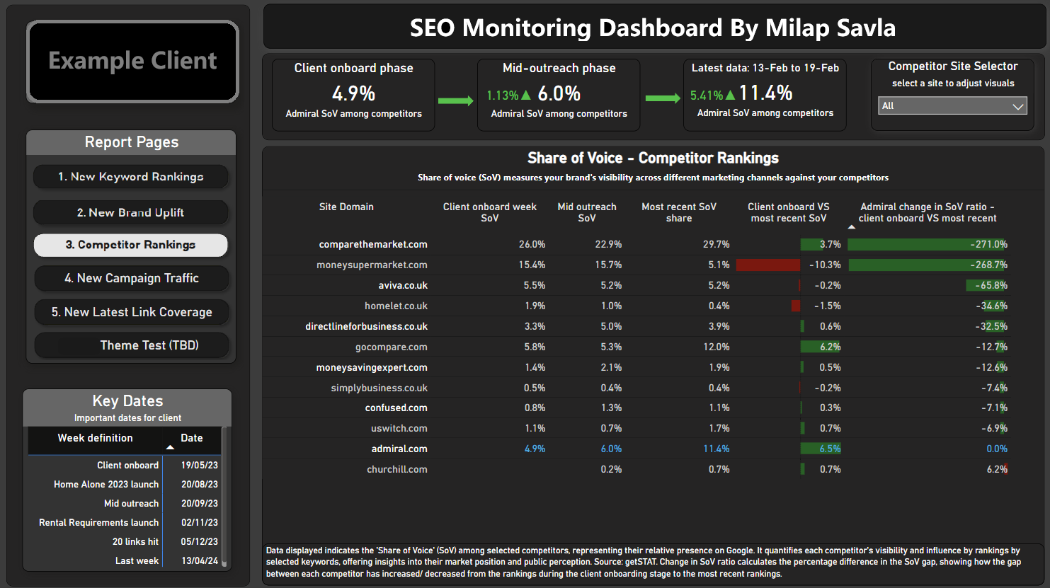
Metrics:
- Share of Voice (SOV): The percentage of total visibility each competitor and the client have for specific keywords.
- Rank Gap: The difference in keyword rankings between the client and their competitors.
Data Source:
- Getstat API: Provides ranking and SOV data for the client and their competitors. The data is visualized to track the narrowing or widening of rank gaps over time.
Page 4. Campaign Traffic Page (page was under construction)
This page focuses on traffic performance for campaign-specific landing pages. By splitting the number of sessions by traffic sources (e.g., organic, social, referral), it provides insights into which channels drive the most traffic to campaign pages. It also highlights how PR campaigns contribute to overall site traffic.
Metrics:
- Sessions by Campaign Page: The number of sessions generated on each campaign-specific page.
- Traffic Split by Source: The percentage breakdown of traffic sources (organic, direct, referral, and social).
Data Source:
- Google Analytics or Adobe Analytics: Depending on the client’s analytics platform, session data is fetched and broken down by traffic source in Power BI.
Page 5. Latest Link Coverage Page
Link coverage is a direct indicator of how successful a PR campaign is at generating backlinks and mentions. This page displays the latest data on the number of links acquired per campaign, the geographical locations where these links are published, social shares, and estimated coverage views.
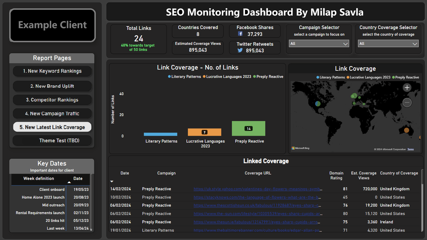
Metrics:
- Number of Links per Campaign: Total backlinks generated by each PR campaign.
- Geographical Distribution: A map showing the global distribution of link publishers.
- Social Shares: The number of shares each link receives across social platforms.
- Estimated Coverage Views: The projected visibility of each link based on publisher traffic data.
Data Source:
- Custom Link Coverage Data: This data comes from internal link-building teams or third-party tools that track backlinks. Social share and coverage view metrics are often provided by tools like Ahrefs or BuzzSumo.
How to Create a Power BI Dashboard for SEO Insights
1. Setting Up Your Environment
Before diving into building the dashboard, here’s what you need to get started:
1.1 Power BI Pro: You’ll need a Power BI Pro account to publish and share your reports with collaborators.
1.2 Power BI Desktop: Download Power BI Desktop for Windows. It’s the full-featured application you’ll use to design and build dashboards. The browser version doesn’t support many essential features and is not sufficient for any serious real-world task.
1.3 Access to APIs and Data Sources: Identify the APIs or data sources you’ll need for your given purpose. Data sources I used were Google Search Console (via Windsor.ai), GetSTAT, Google Analytics, etc.
1.4 Excel Knowledge: A good grasp of Excel formulas is extremely useful, as many concepts translate well to Power BI’s DAX and M languages. Familiarity with Excel’s pivot tables, Power Query, and advanced formulas will give you a head start.
2. Step-by-Step Process for Creating a Power BI Dashboard
Here I’m going to go through the fundamental key stages of building any Power BI dashboard: retrieving data, cleaning and formatting it, designing the front end, and publishing the final report to the web. Here’s a detailed step-by-step guide to help you through the process:
2.1 Retrieving Data
The first step is getting your data into Power BI. To ensure your dashboard refreshes automatically, the data must come from either in-built data connectors or API calls.
a) In-Built Data Connectors
Power BI offers many pre-built connectors for popular data sources like Google Analytics and SQL Server(s).
- These connectors make it easy to import data without requiring custom scripts or extensive configurations.
- Simply select your data source, authenticate with your credentials, and Power BI handles the connection for you.
b) API Calls Using the Web Connector
If your data source isn’t covered by a connector, you’ll need to retrieve it via an API call:
- Use the Web connector in Power BI to fetch data in JSON format.
- Implement a 'FETCHAPI' function in the query to make the API call. Ensure you configure it with relative paths and browser content settings so it remains compatible with Power BI’s data refresh standards. Copy the function below and add it in as a query to call your desired API:
let
  MyFunction = (full_params as text) =>
  let
      Source = Json.Document(
          Web.Contents(
              "https://connectors.windsor.ai/",
              [RelativePath = full_params]
      )
  )
    in
    Source
  in
  MyFunction
Invoking Functions to Make Multiple API Calls at Once
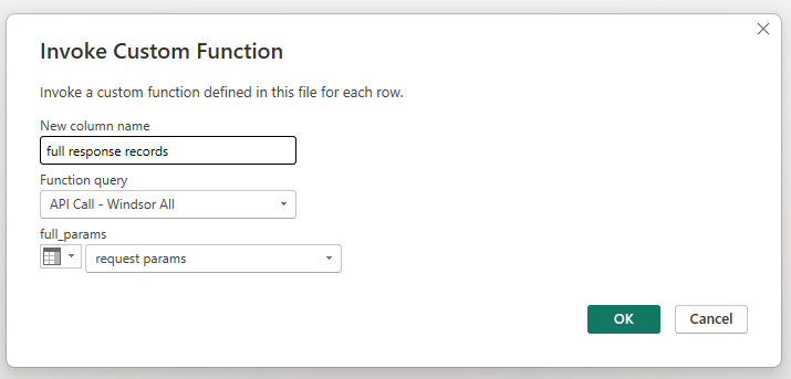
When working with datasets that require multiple API calls with varying parameters, automating this process can save significant time and effort. Power BI’s Invoke Custom Function feature allows you to efficiently handle such scenarios by invoking a pre-built function (as seen above) across a list of API request URLs.
Step 1: Creating the Initial Data Table - Start with a Pre-Built Table: Import a pre-built Excel table into Power BI, which will serve as the foundation for your API calls. This table should include a column with full API request URLs or specific parameters.
Example of a table structure
| ID | API Request URL |
|---|---|
| 1 | https://api.example.com/data?param=value1 |
| 2 | https://api.example.com/data?param=value2 |
Step 2: Invoking the Custom Function:
- Navigate to the Transform Data interface (Power Query Editor).
- Go to the Add Column tab and click on Invoke Custom Function.
- In the dialog box:
- Select the FETCHAPI function you created earlier.
- Choose the column containing the API request URLs or parameters as the input.
Step 3: Expanding the Data
After invoking the function, Power BI creates a new column containing the API responses for each request. To structure the data:
- Click the small expand icon in the column header of the new column.
- Select the fields you want to extract from the JSON response.
- This process runs all API calls in one go and populates your dataset with the results!
Setting up automated API calls that refresh smoothly in Power BI is a fundamental part of any data dashboard. This was one of the most challenging aspects for me when publishing my dashboard!
2.2 Cleaning and Formatting Data
Once your data is retrieved, the next step is to clean and format it to ensure it’s ready for analysis.
Setting Up the Data Pipeline
- 1. Go to the Transform Data page (Power Query Editor) in Power BI.
- 2. Use the graphical interface to clean and format your data, such as:
- Filter rows (e.g., remove unnecessary columns or rows with null values).
- Split or merge columns for better readability.
- Rename fields to make them more meaningful.
- Create new calculated columns or measures using DAX.
- 3. Power BI automatically saves this transformation pipeline, ensuring it runs every time the data refreshes.
Key Tools for Transformation
- DAX: Use it for calculations and creating custom measures.
- M Language: While Power BI handles most transformations automatically with its GUI, advanced users can tweak scripts in the Advanced Editor.
Note: This stage is often the most time-intensive, as you’ll need to ensure all datasets are in the correct format and structure for your visualizations.
3. Understanding DAX and M Languages
Power BI uses two primary languages for data manipulation: DAX (Data Analysis Expressions) for calculations and M (Power Query Formula Language) for data transformation. Don’t worry if you’re not already familiar with these—Google and ChatGPT are your best friends, and you’ll pick up what you need as you go (as I did).
3.1 Introduction to DAX
DAX is a formula language used for creating calculated columns, measures, and custom calculations in Power BI. It’s designed for advanced data analysis and provides functions similar to Excel.
Key Features of DAX:
- Perform calculations on data across rows and tables.
- Aggregate data dynamically based on user interactions with visuals.
- Create measures and calculated fields for reusable insights.
Essential DAX Functions I used:
- SUM: Adds all the values in a column.
- AVERAGE: Returns the mean of values in a column.
- COUNT: Counts the number of rows in a column.
- IF: Performs logical comparisons and returns results based on conditions.
- CALCULATE: Applies filters to modify calculations.
Example Formula: Here’s how to calculate the total clicks from Google Search Console data:
Total Clicks = SUM(SearchConsoleData[Clicks])This formula adds up all the values in the Clicks column from the SearchConsoleData table.
3.2 Introduction to M Language
M Language (Power Query Formula Language) is used for data transformation in Power BI’s Power Query Editor. It’s what runs behind the scenes when you clean or shape your data using the Power BI interface.
Key Points about M Language:
- M is primarily used to transform and load data from various sources.
- You rarely need to write M code manually, as Power BI’s graphical interface handles most of it.
- If you need to tweak M scripts, Power BI’s Advanced Editor makes it accessible.
Example of M Language (Automatically Generated): For example, if you filter a date column to only show the last 6 months, Power BI generates code like this in M:
= Table.SelectRows(#"PreviousStep", each [Date] >= Date.AddMonths(DateTime.LocalNow(), -6))Most of the time, you’ll rely on Power BI’s GUI to manage these steps, making M easy to work with even if you don’t code much. I never really needed to code M Lang myself manually.
4. Building the Front-End of the Dashboard
Once your datasets are clean and formatted, it’s time to design the dashboard.
Steps for Building the Visualizations
- 1. Drag and drop fields into the report canvas to create charts, tables, and other visuals.
- 2. Choose visuals appropriate for the data you’re showcasing:
- Line charts for trends over time.
- Bar charts for comparisons.
- Maps for geographic data.
Tip: Use online examples or inspiration from dashboards to guide your layout and styling. If the data is well-prepared, designing the dashboard will be the easiest part of the process.
Table Relationsips
One tricky part of here is dealing with table-relationships. It’s straightforward once you get your head around it, and if you have prior SQL knowledge, it will come naturally. Power BI has an easy-to-use interface to deal with this.
5. Publishing Your Dashboard to the Web
Publishing your dashboard to the web may sound simple, but it’s often one of the trickiest steps.
How to Publish
- 1. Save your report in Power BI Desktop.
- 2. Publish it to your Power BI workspace using the Publish button.
- 3. Set up scheduled data refreshes to keep your dashboard up-to-date.
Common Issues and Solutions
- Fonts and Visuals Changing Between Browsers (I found that things look differently on Mac compared to Windows, especially fonts).
- Use standard fonts and test your dashboard on multiple browsers before finalising.
- Ensure your API calls are configured with relative paths and meet Power BI’s standards.
- Optimize your data pipeline by removing unnecessary steps or filtering data at the source.
Tip: You may need to iterate between your datasets, pipelines, and visuals to ensure everything works seamlessly online.
Wrapping Up
A comprehensive SEO dashborad pulls together data from all the right places, crunches the numbers, and delivers clear insights to drive better decisions. From tracking rankings to measuring brand uplift and competitor gaps, it simplifies what used to be a time-consuming process.
Yes, there were challenges—hello, API headaches—but the end result is totally worth it. If you’re into SEO or analytics, give it a shot. With a bit of effort, you’ll create something that saves time and impresses clients. Got questions? Reach out—I’m happy to help!